


data studiodigital analyticslooker studio
Adding Sparklines to Scorecards in Looker Studio
A quick guide to adding Sparklines and customising Scorecards in Looker Studio.


The Humble Scorecard
Scorecards use a single metric to display data. There are additional factors in what data is displayed of course, such as the date range and filters, but only a metric is required for the scorecard to work. Let’s look at simple example: the total number of users for a given month. One of the most common additions to the humble scorecard is a Comparison Metric – which compares the data within to another date range. Typically this would be the dynamic Previous Period or Previous Year options, but fixed date ranges are also available, as are target values (also added this year).
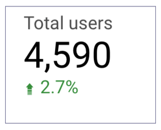 This gives us a bit more context to the data being presented – we can now see that the total number of users was slightly higher than it was in the previous month. But what happened throughout the month? Were there any notable peaks, any dips? One way of doing this would be to add a time series chart to the page for that metric, but Sparklines offer a built-in way of doing this.
How To Add A Sparkline
All that’s required for a Sparkline is an additional dimension to your scorecard. For Sparklines, this will always take the form of a date-based dimension e.g. Hour, Date, Month. You can add this to the Setup menu of your widget, which you’ll see on the right hand side of your Looker Studio interface in Edit Mode – officially called the Data & Properties panel, for what it’s worth. The section we’re looking for is handily titled Sparkline, and when you click Add dimension you’ll only see the available date dimensions, which makes this even easier to implement. Select your desired date dimension, and low and behold, you’ve created a sparkline. Simple, but effective! In roughly the same amount of space on the dashboard (and dashboard real estate becomes very important for larger reports!), I’ve upgraded my scorecard to not only show me the total number of Users, but also how that compares to the previous period, and how it trends over the selected date range.
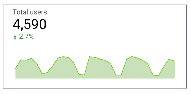
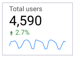 The fun doesn’t stop there however, as there are a few different visual options for this in the Style tab of your widget menu. You can change the sparkline’s colour, add a fill, smooth out the line, and choose how to deal with missing data. If you want to increase the size of your sparkline, simply increase the size of your scorecard. As with most things in Looker Studio, you’re free to play around and see what works best for you – there’s no risk of permanently changing any underlying data, just how it’s presented.
Data Visualisation in Looker Studio
Data visualisation is most effective when it efficiently provides more context and detail around the data, without requiring significant input from the reader, or convoluting your dashboard. Sparklines are another example of easily achieving this, and offer another tool in the arsenal of dashboard builders and report designers, to go alongside other features like comparison metrics, heatmapping, and conditional formatting. For more on Looker Studio, check out our Guide To Using Filters, Reference Lines & Trend Lines, and Using Comparison Metrics. If you have any questions or there’s anything else we can help with on Looker Studio, please leave a comment below, or contact us at [email protected]. You can also follow us on @GlowMetrics or subscribe to our newsletter for more tips and news within the world of Digital Analytics and Marketing.

Posted by
Conor Ross
Conor specialises in data visualisation, designing and creating bespoke data dashboards and automated reports with Looker Studio. With a background in Psychology and Research Methods, he also works on projects focused on improving customer experience and website usability through A/B Testing and Personalisation.
Read more from Conor RossBrowse by Category
- Social Media
- SEM
- SEO
- Google Ads
Digital Marketing
- Google Analytics
- Google Tag Manager
- Google Opimize
Digital Analytics

Optimise your website and marketing campaign performance with Ireland’s leading digital analytics agency
Sign up to our newsletterEnjoyed reading this article? Find more like it below…

Posted by
Issy Gordon
Jul 24th 2024
Digital Marketing Insights
3 min read
Setting Up Your TikTok Ads: A Step-by-Step Guide
Ready to turn your TikTok knowledge into ad success? Let’s get started. This guide will walk you through creating and managing your first TikTok ad campaign. We’ll share tips to...


Posted by
Joanne Kearney
Nov 25th 2020
Digital Analytics Insights
5 min read
GA4 – The new Google Analytics, should you upgrade?
Google Analytics 4 is here! Released mid-October GA4 has been built to provide a more holistic and insight driven analytics platform- and one that is more suited to evolving privacy...
Posted by
Conor Ross
Oct 6th 2020
Digital Analytics Insights
3 min read
Data Studio Showcase: Formula 1 2020
Data visualisation is fast becoming one of the most important aspects of driving a data driven decision making process, supporting the presentation of key statistics and important information in a...
Leave a Reply