


Data Visualisationdigital analyticsGoogle Data Studiolooker studio
Comparison Metrics in Data Studio
Looker Studio (formerly known as Google Data Studio) is a brilliant way of presenting the most relevant data from any source, in a way that’s easy to understand, interpret, and...


Looker Studio (formerly known as Google Data Studio) is a brilliant way of presenting the most relevant data from any source, in a way that’s easy to understand, interpret, and share. Whether it’s Google Analytics, Paid Advertising Campaigns, or Social Channels, a fully customisable report allows for comparisons to be made based on historical data or between two distinct data sources.
One thing to be mindful of in Looker Studio is that, by default, the comparison metrics available may not immediately represent the nature of the comparison you are trying to highlight. Take for example the metric of Bounce Rate, the percentage of single page visits without a meaningful action. To say that the Bounce Rate has improved, the percentage has decreased. In Google Analytics, this decrease will be displayed as a positive change and show the comparison with a green colour, because it considers the nature of the comparison metric. Conversely, if the Bounce Rate increases, the value will show in red.
Style: Changing Comparison Metrics
This is not the case in Looker Studio, where any instance of a metric returning a higher number than the comparative data is shown as a green increase. This is counterintuitive for our example of Bounce Rate, as the Bounce Rate increasing in magnitude is a negative change, and should be displayed in red. Thankfully, this can be quickly and easily changed in the Style menus when editing a widget!
To change the colour of a comparison metric, click on the Widget while in Edit Mode and you will see two tabs appear on the right: Data & Style. In the Style menu, there is a section dedicated to the Comparison Metric of your widget. Here, you can change the colour of comparative increases and decreases, as well as show the absolute change rather than the percentage change, or show the comparison label which highlights the exact time period the comparison is based on. 
Three Distinct Metrics: Clicks, Cost-Per-Click, and Cost
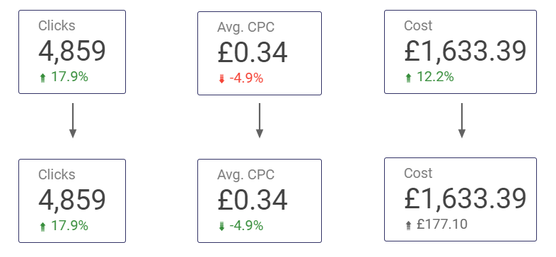
Let’s look at an example of three frequently used metrics for PPC Campaigns: Number of Clicks, Average Cost-Per-Click, and Total Cost. Here we have three distinct metrics, in which the nature of comparisons varies. For Clicks, it is a positive to see an increase in this number. However, for Avg. CPC, ideally we would like to see this value reduced.
Finally, for the total cost, it may not be indicative of a positive or a negative change in performance that the Cost is different from a previous period. We can change these comparison metrics using the Style menu.
Small Updates Lead To Big Improvements
These are all important features when it comes to presenting your data on a dashboard that is easy to understand for those who view it. The nature of comparisons may change, and it may be better to show absolute change instead of percentage change, particularly for metrics that regularly show a lower value, or when already dealing with percentages, to avoid any erratic figures or confusing figures.
Customising a Looker Studio report is an important process towards building and optimising a unique dashboard for your data. These features, including Comparison Metrics, Absolute Change and Comparison Labels may be small aspects of a larger report, but ensuring they are presenting the data in an intuitive and easy to understand way can make a significant difference towards reliable and effective data visualisation.
Want to Learn More About Looker Studio?
If you’re having trouble with comparison metrics or any other features in Google Looker Studio, please feel free to leave a comment below or contact us at [email protected] – we’d be happy to help!
For more on Looker Studio, check out our Guide To Using Filters and Using Reference and Trend Lines.
You can also stay up-to-date by following GlowMetrics on Twitter or LinkedIn or by subscribing to our newsletter (link below) for the latest tips and news in the world of digital analytics and marketing.
Don’t forget to sign up for a FREE account on our Resource Hub to access a wealth of valuable resources, including exclusive Looker Studio how-to videos and insights.

Posted by
Conor Ross
Conor specialises in data visualisation, designing and creating bespoke data dashboards and automated reports with Looker Studio. With a background in Psychology and Research Methods, he also works on projects focused on improving customer experience and website usability through A/B Testing and Personalisation.
Read more from Conor RossBrowse by Category
- Social Media
- SEM
- SEO
- Google Ads
Digital Marketing
- Google Analytics
- Google Tag Manager
- Google Opimize
Digital Analytics

Optimise your website and marketing campaign performance with Ireland’s leading digital analytics agency
Sign up to our newsletterEnjoyed reading this article? Find more like it below…

Posted by
Nicola Russell
Feb 15th 2019
Digital Analytics Insights
4 min read
It’s Time to Check your Google Analytics for Amazon Bot Spam
UPDATE: As of 4th February 2020, the 'Network Domain' and 'Service Provider' dimensions in Google Analytics have been marked as 'no longer supported' and are returning (not set) values -...


Posted by
Hannah Magorrian
Dec 20th 2022
Digital Analytics Insights
3 min read
Overcoming the GA4 Quotas in Looker Studio
Are limited GA4 Quotas causing errors in your Looker Studio/Google Data Studio reports? Have you looked at your Looker Studio dashboard built with the GA4 connector only to be met...

Posted by
Issy Gordon
Jul 24th 2024
Digital Marketing Insights
3 min read
Setting Up Your TikTok Ads: A Step-by-Step Guide
Ready to turn your TikTok knowledge into ad success? Let’s get started. This guide will walk you through creating and managing your first TikTok ad campaign. We’ll share tips to...
Leave a Reply