


A Guide to New Chart Types in Looker Studio
It can be easy to stay in our visualisation comfort zone with bar charts, pie charts, and line graphs, but did you know there is a whole world of data storytelling possibilities waiting to be explored in Looker Studio?


If we’re being honest, we all have our favourite charts in Looker Studio. It can be easy to stay in our visualisation comfort zone with bar charts, pie charts, and line graphs, but did you know there is a whole world of data storytelling possibilities waiting to be explored?
Over the past year, Looker Studio has unveiled a slew of new chart types that can take your dashboards to the next level. From exploring connections on maps to visualising complex journeys, these new additions will breathe fresh life into your data analysis. Let’s go through a few of the best new charts!
Combo Map
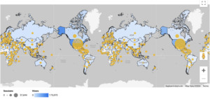
You can now combine the properties of a filled map and a bubble map with the new combo map, which allows you to go beyond the basic locations by adding additional layers of data. Locations are shaded based on one metric, like views in the example above, while bubbles of differing sizes represent another metric such as sessions.
Use a combo map if you want to:
- Show location alongside other data
- Highlight variations within areas and reveal patterns, for example do locations with high revenue have a large number of users?
Waterfall Chart
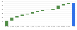
The waterfall chart lets you visualise sequential positive and negative values that add up to a total, with each bar representing a positive or negative change. It’s a step by step breakdown of how your data contributes to a total with each layer building on top of the last, flowing like a waterfall.
Use a waterfall chart if you want to:
- See how revenue streams or expenses break down, how different stages of a process contribute to a final yield, or how various adjustments lead to a final profit or loss
- Better understand the journey your data takes from point A to point B rather than just the total
Sankey Chart
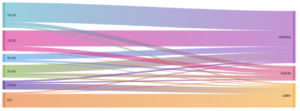
Sankey charts are particularly effective for analysing the flow of data over time. It uses connected nodes to represent stages in a process, and the thickness of the links between them shows the volume moving between those stages, with wider links indicating a larger flow of traffic.
Use a sankey chart if you want to:
- Better understand customer journeys, like how users are navigating through your site
- Visualise complex financial data and see how money flows through an organisation
- Better understand a process with defined stages
These are just a few of the new chart types that Looker Studio has introduced over the last year; there are plenty more for you to explore – happy reporting!
Want to Learn More About Looker Studio?
For more on Looker Studio, check out our Guide To Using Filters and Using Comparison Metrics. If you have any questions or there’s anything else we can help with on Looker Studio, please leave a comment below, or contact us at [email protected].
You can also stay up-to-date by following GlowMetrics on Twitter or LinkedIn or by subscribing to our newsletter (link below) for the latest tips and news in the world of digital analytics and marketing.
Don’t forget to sign up for a FREE account on our Resource Hub to access a wealth of valuable resources, including exclusive Looker Studio how-to videos and insights!

Posted by
Hannah Magorrian
Hannah is a Digital Analytics Executive at GlowMetrics, working on creating data dashboards and assisting on wider analytics work across Google Analytics and Data Studio.
Read more from Hannah MagorrianBrowse by Category
- Social Media
- SEM
- SEO
- Google Ads
Digital Marketing
- Google Analytics
- Google Tag Manager
- Google Opimize
Digital Analytics

Optimise your website and marketing campaign performance with Ireland’s leading digital analytics agency
Sign up to our newsletterEnjoyed reading this article? Find more like it below…

Posted by
Joanne Kearney
Apr 30th 2024
Digital Analytics Insights
4 min read
Using GA4 to Inform a Website Redesign
Are you planning a website redesign? Before diving in, have you conducted thorough research using previously collected user data? In today's data-driven world, there’s no excuse not to use the...


Posted by
GlowMetrics Staff
Mar 20th 2019
4 min read
The Advantages of Google Analytics 360 Suite
What is Google Analytics 360? Google 360 is an ecosystem built by Google to help understand WHO visits a website, the JOURNEY they make when they get there, as well...
Posted by
GlowMetrics Staff
May 12th 2016
2 min read
GlowMetrics Awarded Google Analytics Certified Partner Status
We've some great news to share with you today, we have just been awarded Google Analytics certified partner status. Being a certified partner, we will be given insights into the...
Leave a Reply